mu font
descending caps, since becoming enamoured with the descending serifless I variant of the typograffic font (with Iota), had become the focus of the latest font development. The expressiveness rendered to the typefaces by these unique descenders combined with dyslexic readability instantly made these my favourite reading fonts.
Much of the effort has been spent on tweaking the fontforge descender scripts to better render the contrast of the strokes (for the Linux desktop), and position and shape of their italics and, importantly, correct the hinting (position) at small font sizes (to eliminate the need for font size specific font files). Once completed, the family of monospaced fonts in rotation appeared finalized :)
‧ ‧ • ‧ ‧
After extensive reading usage, two other glyph options have come to light to further refine this set of dyslexic fonts—for better or worse, YMMV—and produce a true “quad” of fonts (the past “trio” of four(!) typefaces included two descending caps fonts which were almost identical).
These two revelations are lower case glyphs which add air to their adjacent characters..
| letter | from | to | fonts |
|---|---|---|---|
| m | serifless | toothless-rounded | * |
| a | double-storey-serifless | double-storey-toothless-corner | mu |
rounded m
a change so obvious that familiarity bias is the only explanation for its omission during the selection of non-mirroring asymmetric lower case glyphs..
| lower case | from hyperlegible | to dyslexic |
|---|---|---|
| b | toothed | toothless-rounded |
| d | toothed-serifless | |
| p | eared | earless-corner |
| q | hook-tailed | |
| n | straight | |
| u | toothed | toothless-rounded |
| -> m | eared | earless-rounded |
Just as the toothless-rounded lower case u replaced its familiar toothed glyph in these fontsets, the earless-rounded lower case m replaces its universally familiar eared-serifless shape.
While the toothless-rounded u is chosen for its asymmetry to the straight lower case n, the earless-rounded m is chosen for its dyslexic distinction from the n (and bigram “nn”)—as well as, reflecting the symmetry of its upper case glyph.
The increased air and distinction between adjacent letters is immediately apparent, especially at small font sizes with bigrams mm mn nm (and words containing both characters in any position, for that matter) and am dm gm um—asymmetrically opening the adjacent vertical strokes, and more so with other glyphs as a result of its earless corner.
The readability this glyph adds i feel warrants applying it to the dyslexic collection of monospaced typefaces.
articulate font
this Atkinson Hyperlegible inspired font is the base font this dyslexic collection. It remains largely unchanged, with its dyslexic adjustments (above), adding the earless-rounded lower case m..
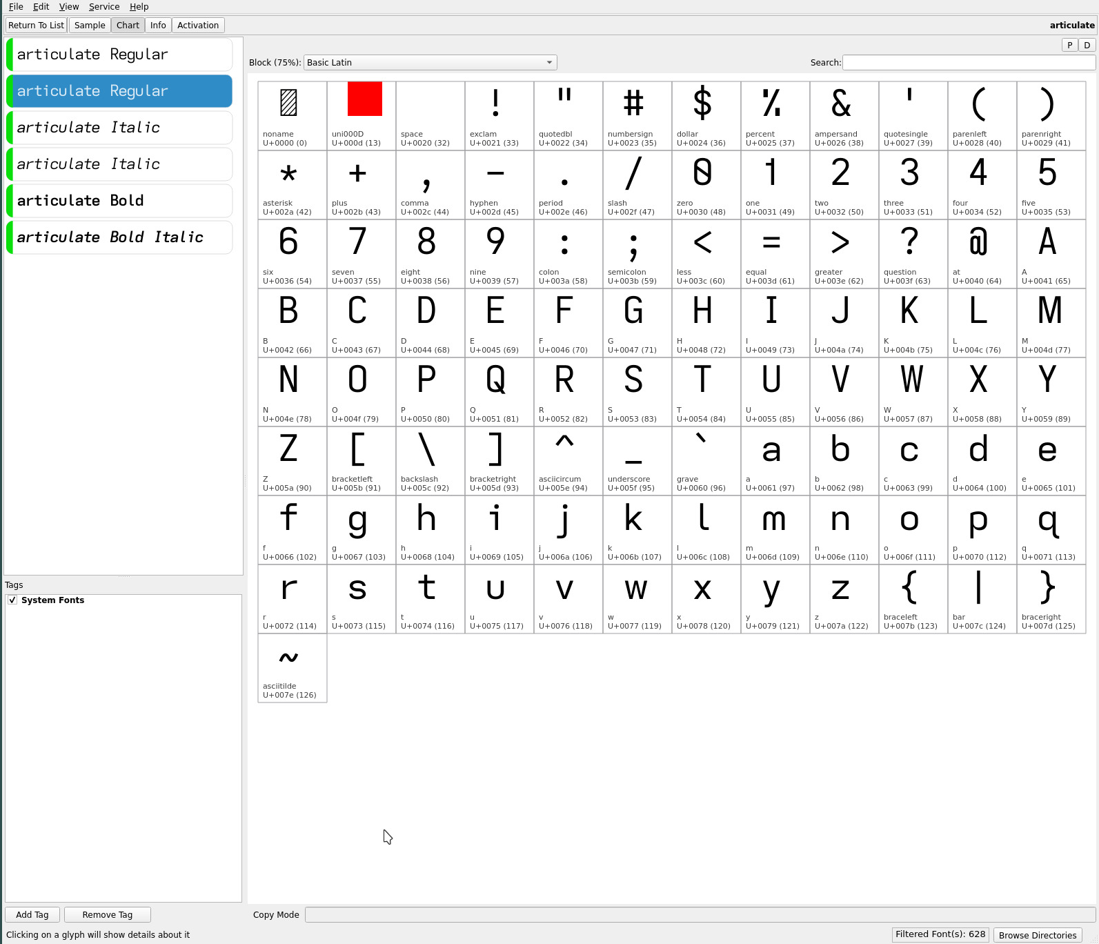
typograffic font
the Universal Grotesk twist on the articulate font similarly remains largely unchanged, save for the addition of the earless-rounded lower case m..
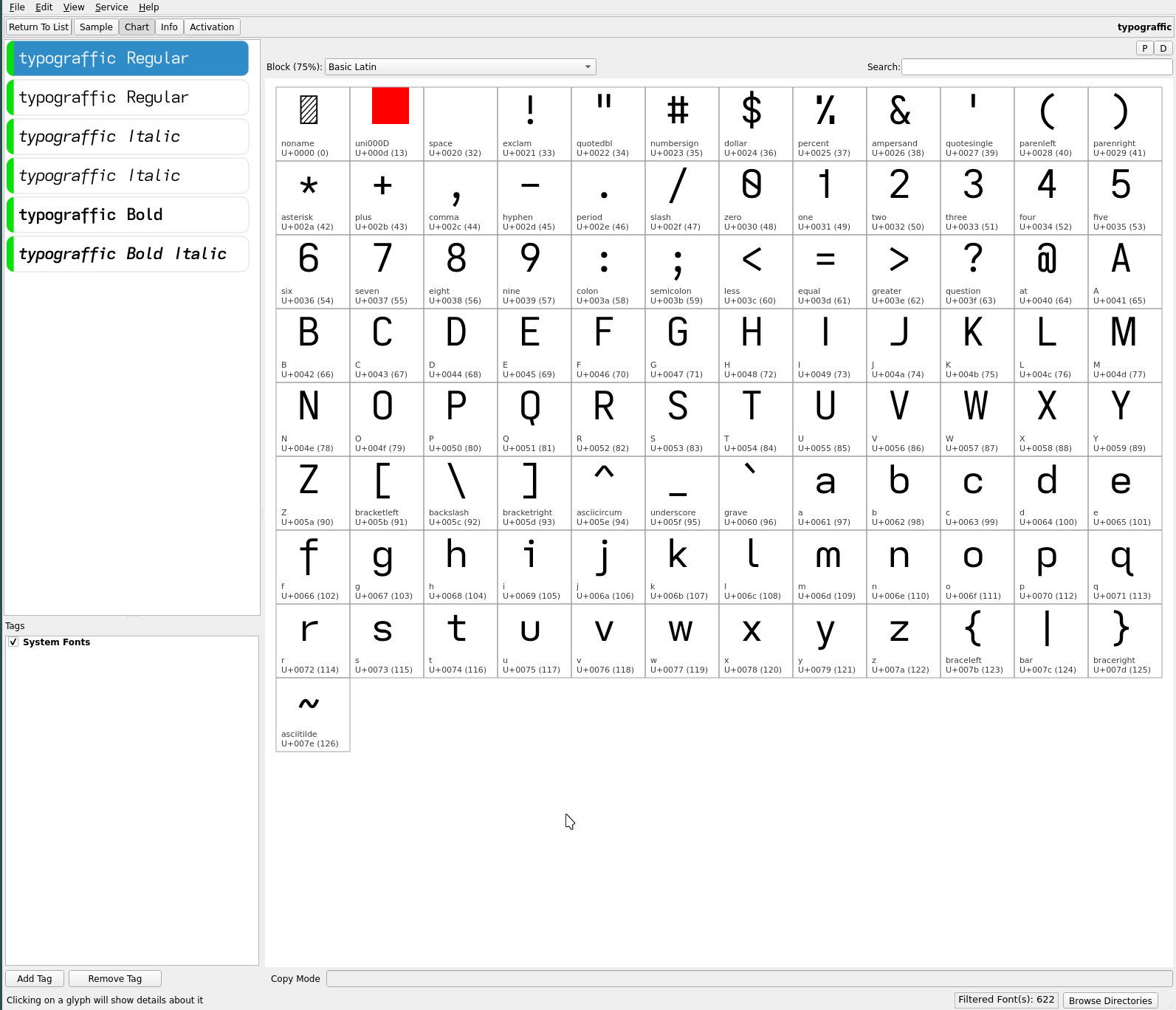
It differs from the articulate font..
| upper case | articulate | typograffic |
|---|---|---|
| G | toothed-serifless-hooked | toothless-rounded-serifless-hooked |
| I | serifed | serifless |
| J | serifless | flat-hooked-serifless |
| Q | crossing | straight |
| lower case | articulate | typograffic |
|---|---|---|
| f | flat-hook-serifless | flat-hook-extended |
toothless-corner a
The toothless-corner double-storey lower case a is perhaps more radical than the rounded m glyph change. The regular tooth arguably “anchors” the letter from a dyslexic perspective and, as such, remains with the articulate and typograffic typefaces.
The toothless-corner glyph is subtly distinct from the standard double-storey a, adding a touch of air between the ah ak am an ap bigrams with their left side vertical strokes and a general air to adjacent letters.
mu font
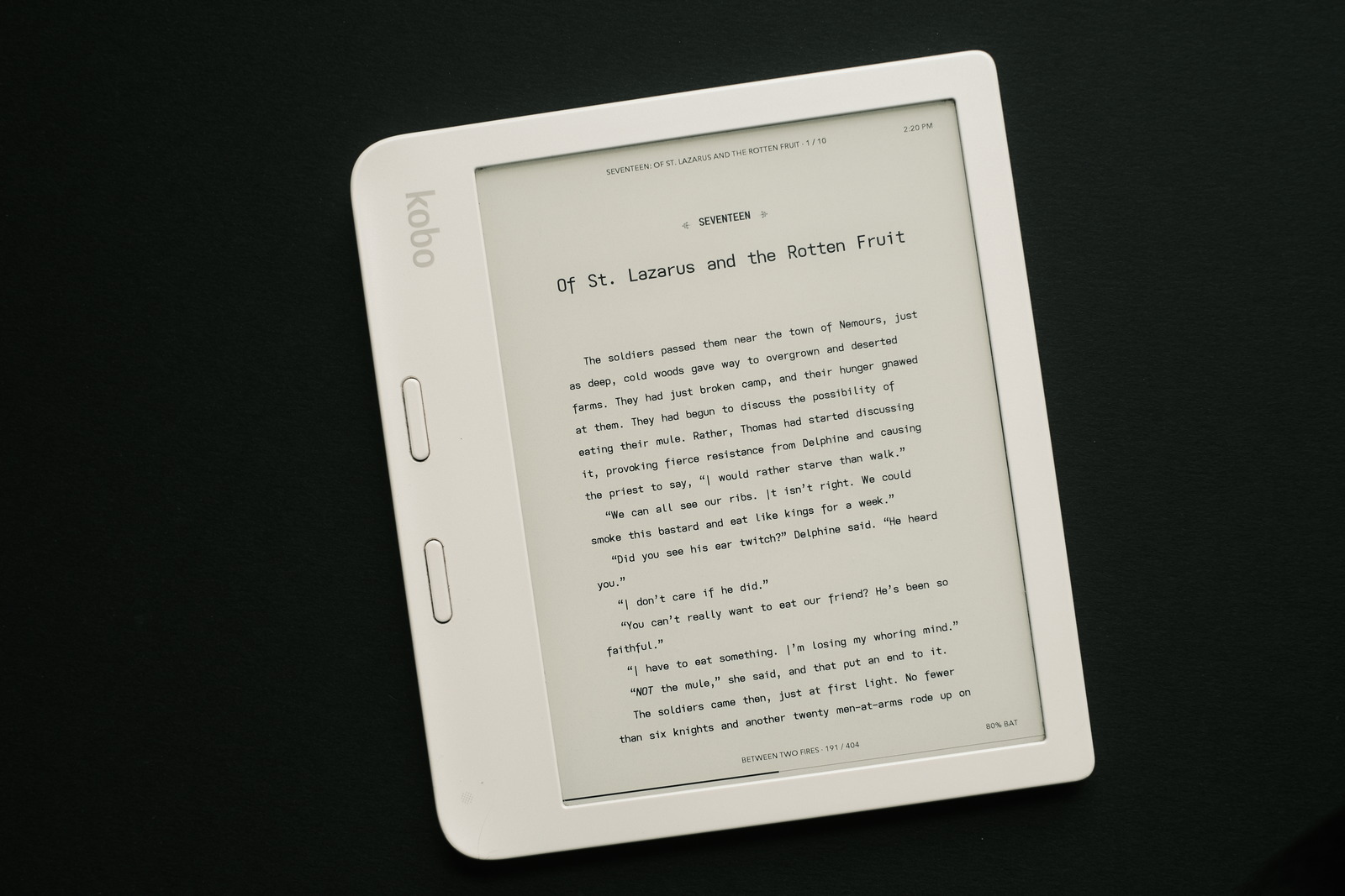
becomes the most unique addition to the “current” in use (4) font sets, in place of the former iota typeface by adding, in addition to the aforementioned earless-rounded lower case m, the toothless-corner double-storey lower case a and semi-open 4 (much like the usage of the open amphersand)..
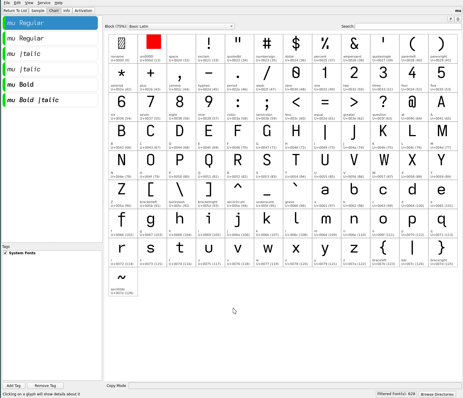
It differs from the articulate font..
| upper case | articulate | mu |
|---|---|---|
| G | toothed-serifless-hooked | toothed-serifless-hookless |
| I | serifed | descending serifless |
| J | serifless | descending-flat-hook-serifless |
| Q | crossing | straight |
| lower case | articulate | mu |
|---|---|---|
| a | double-storey-serifless | double-storey-toothless-corner |
| f | flat-hook-serifless | flat-hook-extended |
| j | flat-hook-serifless | flat-hook-serifed |
| numeric | articulate | mu |
|---|---|---|
| 4 | closed | semi-open |
mu sits nicely between typograffic and upsilon (below) in terms of distinctiveness from the articulate typeface.
The font name “mu” reflects its unique use of these two symmetric lower case letters (in these font sets)—continuing this site’s tradition of naming fonts containing descending capitals after Greek letters.
upsilon font
supplants the Ypsilon font adding the earless-rounded lower case m and open non-crossing numeric 4..
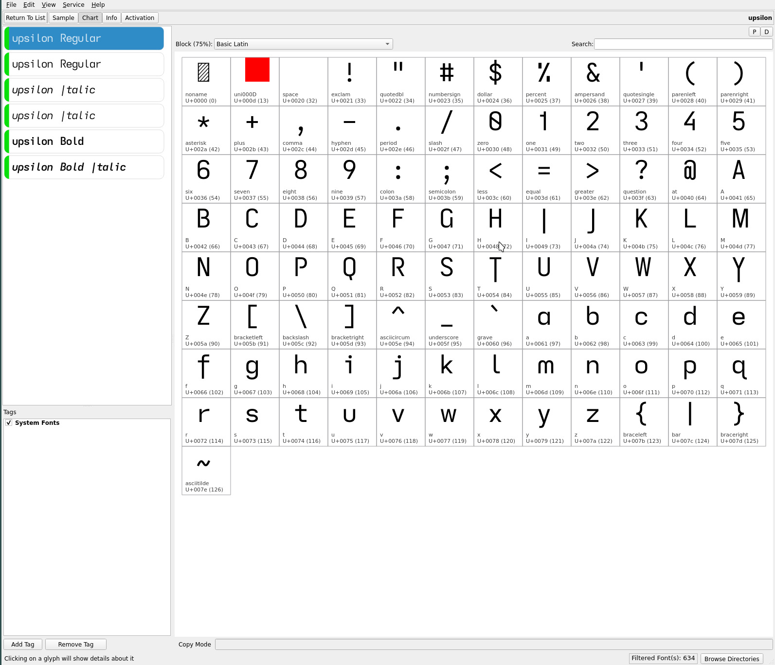
It differs from the articulate font..
| upper case | articulate | upsilon |
|---|---|---|
| B P R | closed | open |
| G | toothed-serifless-hooked | toothed-serifless-hookless |
| I | serifed | descending serifless |
| J | serifless | descending-flat-hook-serifless |
| Q | crossing | straight |
| T Y | serifless | descending serifless |
| lower case | articulate | upsilon |
|---|---|---|
| a | double-storey-serifless | single-storey |
| f | flat-hook-serifless | flat-hook-extended |
| j | flat-hook-serifless | flat-hook-serifed |
| numeric | articulate | upsilon |
|---|---|---|
| 4 | closed | open non-crossing |
Save for the single-storey lower case a and open non-crossing 4, upsilon is largely the mu font transformed with additional descending and open caps. Still, those descenders and the lower case a are significant and make for a completely different feeling typeface.
dyslexic ranking
in terms of dyslexic readability ranking, (Iota successor) mu with its double-storey lower case a enhances its ranking..
| typeface | rank | dyslexic penalty |
|---|---|---|
| articulate | 1 | |
| typograffic | 2 | straight Q |
| mu** | 2 | straight Q |
| upsilon | 3 | straight Q, single-storey a |
The addition of the double-storey lower case a to the mu font
separates it nicely from the upsilon font (more so than their Iota
and Ypsilon predecessors)—there is a reason for the prevalence of
the double-storey lower case a—providing now a distinctive quad of fonts. The font’s side bearing plays a role in the choice of this toothless-corner glyph—looking more pleasing (air) with the tighter ereader side bearing
applied.
**Arguably, the mu font might be considered ranked a smidgen higher than
typograffic with its more open and airier toothless double-storey
A (the counter argument being the tooth anchors the glyph).
‧ ‧ • ‧ ‧
If you haven’t noticed already, the earless-rounded lower case m has already made it to this site’s webfont.
Whereas before, i had gravitated to the Ypsilon font for its unique character (Iota differing minimally), the distinctiveness of the mu font now has added attraction with its toothless-corner lower case a when paired with the upsilon font.
As always, YMMV—i suspect most will continue to prefer the more classic articulate and typograffic typefaces (if they haven’t found these latest changes already too radical for their tastes)!
repos
The latest ereader font trio quad may be found on
OneDrive,
along with the earlier typefaces discussed on this site.
For those who prefer the eared lower case m, the former font trios remain available—though these fonts have not inherited the latest fontforge tweaks..
| history | tweak |
|---|---|
| emdash | adjust with to “M + Space” |
| ellipsis | adjust with to “M + Space” |
| hinting | fix descending caps irregularities at small font sizes** |
| side bearing | match side bearing rendered between Kindle and Kobo |
** No longer require separate font files for small or normal/large font size usage on ereaders.